Wednesday, March 26, 2014

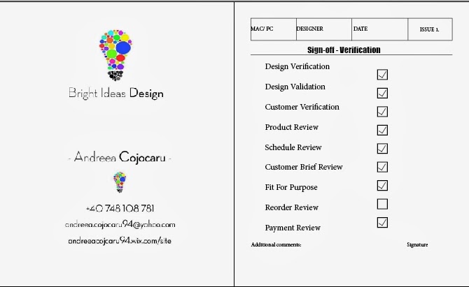
Sign-Off Verification - Bright Ideas Design


I used Bright Idea Design business card as the main project. 

Validation and Verification - Design


Experiments with type, shape, colour, photography, layout


For this week I tried to create a magazine page using grids, colours and photography. I coloured the grids and I created a green polygon to write the name of the article inside it (font - Gotham - applied stroke). I broke the grids with the polygon and the photo which I sent it to back. For article text I used Futura Maxi CG Black font.

Grid Layout Case Studies


This layout is very interesting because it formats the articles in an appealing way, capturing the interest because of its unique style. The creativity aspect is created by applying images that fit with the article. All the columns are incorporated with the wheels and the text provides various shapes which give rhythm to the overall design.  The grids create tension as they are divided in five main columns broken by images. Even the grids that are not broken by images are divided by titles with different sizes. I do consider that despite the fact that the page looks very interesting it is very complicated to follow the article.  


This article is very interesting because of the fact that every grid is actually a letter or an extension of it. There can be seen the newspaper's title in the main article. The text can be read easily even if the grids are broken so many times. There are 2 grids in total, but the structure is divided into 3 parts, yet the article does not have a symmetry.

Breaking the Grid


For my first experiment I create a simple appearance to introduce a quote in the middle of the article. I used the same font for every column, but I changed the size for the centre quote. The main article font is 18 pt., whereas the quote has 24 pt.


For my second experiment I used a yellow square in order to highlight the quote. I also put it in the middle of the page to capture the attention. By placing there the most interesting quote I tried to make the reader curious to read the whole article.


For the third experiment I used a brown square to create a contrast between the article and the quote. 


For the final experiment I used a red polygon in order to create an interesting overview. I liked the way that the text fits every corner of the polygon and I used white colour for the inside text to make a connection with the article, creating a light contrast. 
Grid Layouts


          Working Abroad


I chose as a cover a photo that express the theme - Working Abroad- For the title I used Stroke in order to be visible. For the logo I used Papyrus - Regular- font and for the title I used Book Antiqua font. The colour - blue- I do believe that expresses the distance and it gives a feeling of depression, yet I used it to create a connection between readers and people who actually Work Abroad.


First and second pages are containing the main article. I used a the photo to create an understanding for readers and to express the message of the article. I used two columns to make the text clear and I think that the blue circle break the grids in harmony, creating a perfect symmetry. 


For the third page I used the same blue circle to introduce the final part of the article. In the circles there can be seen the most important quotes from the article. I used the photo in the left corner of the page because I think that its colours fit the blue circle and express the other part of working abroad: the self satisfaction. 

Experiments with type, shape and colour


For this week I explored the shapes by applying images. I created the text by modifying the Vertical and Horizontal Scales.