Friday, March 28, 2014

Marketing in a day


I chose to develop a poster that clearly express my target audience interest. I used the gradient to capture the attention. I kept the same font and I added the logo and the cover for a clue. I wrote 'Fashion, Vintage, Shopping, New Style' because I do consider that these words express the main topics of the magazine.


For the online banner I chose to duplicate the cover to look more interesting, I kept it simple but attractive. 


This sticker can be used for mugs, T-shirts, bags, laptops, iPad or iPhone.


TRASHION! on issuu

http://issuu.com/andreeacojocaru0/docs/trashion


TRASHION! on Web


I decided to have the logo as the home page because I do consider that it is very interactive. However, I changed some aspects of logo: I duplicated the title and I kept it only on white background. 


This is my first mock up for indicative articles page. I kept the concept of the cover and I created the titles as buttons, yet the reader can access a article only by clicking on its title. I kept the photo from the cover and the details about the issue and date.


For this mock up I changed the colours of the cover, making it with the same colour palette as the logo.


The last version of indicative articles page made me to experience a black & white mock up. I edited the photo by making it back & white in order to be suitable for the titles and logo.

TRASHION! - iPhone Version


The iPhone version I increased the font size and I changed the layout. I kept the same concept for the entire iPhone version but at the same time it is suitable for mobile used.


TRASHION! - iPad Version


For iPad version I redesigned all the pages to fit for the iPad dimensions. I kept the same concept, but I changed most of the articles layout. Because of the fact that the photo that introduce the first article has different dimensions, I crop it for these dimensions.


For the articles I increased the font size to be visible for readers. Thus, I redesigned the layout, changing the positions of photos.

I kept the same appearance but I reduced the number pages because I needed to fit my work on a single page layout suitable for iPad.


Wednesday, March 26, 2014

TRASHION! Logo


The concept of the logo was to keep it simple but interesting. I chose the black & white combination mainly because it looks fashionable, but at the same time it is regarded to my target audience.

Magazine in a day - TRASHION!

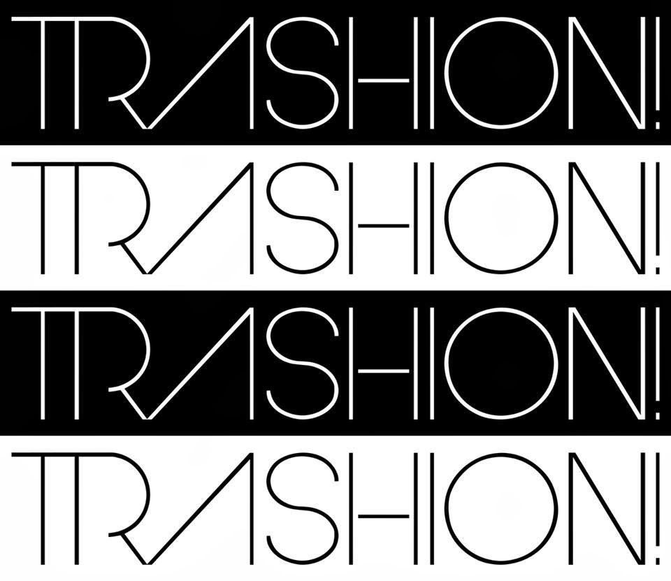
For the photo I used on cover I edited the contrast and I added a light filter. For the title, 'TRASHION!', I used two fonts: Arual and Dolce Vita Light. I duplicated the layout three times and I repositioned to create a dynamic view upon the title. For the title I used Cyan and Magenta. I put the main three articles in the left on the cover in order to highlight the subject of the magazine. Magenta, Cyan and Yellow are the colours used for the articles and I used Arual font. I combined the two fonts because they are very similar, using Illustrator. I redesigned the letters into a type which I like more and I would see it as a front cover type. The whole concept was to create a new dynamic, modern look to preserved the fashion and teen spirit.


I created the layout design for content to fit for the main subject. The font and colours are the same as in the title, yet I created a symmetry. I created the ribbons to insert the number of the pages and to write the topic of them. I kept the ribbons for design on the entire magazine. I do believe that these create a youth fashionable look, especially for my target audience. 


I used this photo to introduce the article and I kept the ribbon to show the title. The font used on the text is Helvetica Neue LT STD Thin to enhance the visibility for the reader.


To introduce the article I added the title on a ribbon. I used two grids in order to make the article easily to follow. I inserted the picture into the main text to break the text's line.


The next part of the magazine is highly connected with the previous pages. I kept the layout but I inserted the illustration to introduce the article. From my point of view, the illustration can be a clue about the text's subject, yet it can make the reader curious. 

For this article I kept the concept of the previous pages, but I changed the colour of the title, thus making the magazine more interactive and to fit for my target audience. I used two columns and the font and size are the same.


To create a dynamic look for the magazine I put the final part of the previous article on other part. I inserted two pictures in order to theory up the text. For the next article 'how to Shorts' I used different alignments but I kept the main concept.


For the final part I used the same type of ribbon as the one from the first article to create symmetry.  I broke the grids with some helpful images, following the written tips and demonstrating them through images.

Sign-Off Verification - Bright Ideas Design


I used Bright Idea Design business card as the main project. 

Validation and Verification - Design


Experiments with type, shape, colour, photography, layout


For this week I tried to create a magazine page using grids, colours and photography. I coloured the grids and I created a green polygon to write the name of the article inside it (font - Gotham - applied stroke). I broke the grids with the polygon and the photo which I sent it to back. For article text I used Futura Maxi CG Black font.

Grid Layout Case Studies


This layout is very interesting because it formats the articles in an appealing way, capturing the interest because of its unique style. The creativity aspect is created by applying images that fit with the article. All the columns are incorporated with the wheels and the text provides various shapes which give rhythm to the overall design.  The grids create tension as they are divided in five main columns broken by images. Even the grids that are not broken by images are divided by titles with different sizes. I do consider that despite the fact that the page looks very interesting it is very complicated to follow the article.  


This article is very interesting because of the fact that every grid is actually a letter or an extension of it. There can be seen the newspaper's title in the main article. The text can be read easily even if the grids are broken so many times. There are 2 grids in total, but the structure is divided into 3 parts, yet the article does not have a symmetry.

Breaking the Grid


For my first experiment I create a simple appearance to introduce a quote in the middle of the article. I used the same font for every column, but I changed the size for the centre quote. The main article font is 18 pt., whereas the quote has 24 pt.


For my second experiment I used a yellow square in order to highlight the quote. I also put it in the middle of the page to capture the attention. By placing there the most interesting quote I tried to make the reader curious to read the whole article.


For the third experiment I used a brown square to create a contrast between the article and the quote. 


For the final experiment I used a red polygon in order to create an interesting overview. I liked the way that the text fits every corner of the polygon and I used white colour for the inside text to make a connection with the article, creating a light contrast. 

Grid Layouts


          Working Abroad


I chose as a cover a photo that express the theme - Working Abroad- For the title I used Stroke in order to be visible. For the logo I used Papyrus - Regular- font and for the title I used Book Antiqua font. The colour - blue- I do believe that expresses the distance and it gives a feeling of depression, yet I used it to create a connection between readers and people who actually Work Abroad.


First and second pages are containing the main article. I used a the photo to create an understanding for readers and to express the message of the article. I used two columns to make the text clear and I think that the blue circle break the grids in harmony, creating a perfect symmetry. 


For the third page I used the same blue circle to introduce the final part of the article. In the circles there can be seen the most important quotes from the article. I used the photo in the left corner of the page because I think that its colours fit the blue circle and express the other part of working abroad: the self satisfaction. 

Experiments with type, shape and colour


For this week I explored the shapes by applying images. I created the text by modifying the Vertical and Horizontal Scales.

Tuesday, March 25, 2014

CD Cover Design Project


Kalistenic


Kalistenic is a Romanian band formed in 
late March 2011.Kalistenic brings a distinct sound to the romanian music scene. Having aselect lineup with members influenced by a lot of various genres, Kalistenic combines groove and prog metal to bring a unique sound to the metal industry. George, Loris, Razvan and Gabi recorded their first demo in June 2011, and had their live debut in August 2011. Along with Andrei, their newest member, they are working on new tracks soon to be heard on their upcoming album.


CD Cover


All the photos I used as experiments and the final CD cover were provided by Valeriu Catalineanu - the photographer- himself. He send me these photos for free without any Copyrights condition to use only for this project.   


I used Face your Fears font downloaded for free from dafont.com. I used this font because I do consider that it fits for the genre of music the band promotes. 'Alone I die' - the title of the CD- is actually one of their Hits, yet the font is connected to the message that the song expresses. I chose black as a colour because black is a trademark for rock metal music, yet I wanted to create a specific atmosphere. I chose this photo because it is very expressive according to the title. 


Photographic Case Studies


The message 'You can help. Stop global warming' is significant accentuated by an image that presents two penguins: a mother and her child. They are looking helpless to a container of toxic substances that are burning, a factor that causes global warming. The background is apocalyptic, presenting the destruction of Earth, the main colour being grey. The only bright colours are the ones from the message and orange, colour of fire. This picture expresses depression, making the main message more dramatic. The whole advertisement captures the human attention by presenting a possible hypothesis of global warming, fact that probably would not capture the attention without a strong image. Even the message is written on bin trash metal, expressing the idea that this will be our last material if we continue to destroy the natural resources.
Having penguins as the main characters, the ad conceptualize the human feelings and kindness for animals and the campaign advices us to protect animals’ natural habitats in order to save the Planet. The way penguins are looking at the container gives a strong emotion and sadness, forcing us to be more careful with our lifestyle.

The message captures a strong meaning by adding this apocalyptic image, thus the main purpose of the campaign, to alert people about the global warming, is accomplished.  


 As the obesity is a global issue that few of us are conscious about, this campaign alerts overweight people that ‘Obesity kills’. It is used the most common killing arm: a pistol, making the message obvious for everyone. The pistol is actually a chocolate tablet and the bullet is the bitten part of the tablet. The excess of sugar, in this case chocolate, is the first cause of obesity, yet the image has a strong impact. The message ‘Obesity takes one life every 12 seconds’ is demonstrated by the concept of the photo.

Own the Colour

Tiffany & Co box
Tiffany Blue

Tiffany & Co blue colour is trademarked in the US and elsewhere. This nuance of blue expresses elegance and luxury. It gives the experience of touching the finest and royal jewellery, yet customers can actually feel the pure form of the jewellery only by looking at the blue little box. The colour is produced by Pantone, with PMS number 1837 which means the year of Tiffany & Co fondation. The colour is not printed in the Pantone Marching System and it is available only for the company. This nuance of blue is so famous that it has a Wikipedia page.


                                                                              Pullman Brown
UPS Truck

The brown colour used by UPS is now a trademarked for the company. They used the same brown nuance for their trucks since 1916. In 1998 a former UPS executive explain their reasons of choosing this colour: 'it was the epitome of luxury at the time' The brand's tagline is 'What can Brown do for you?' Brown gives a serious overlook for the company, as they based their services on professionalism.This colour is also associate with plainness in some cultures over the world.